
Sprouts Farmers Market is an American grocery store chain that specialises in providing a wide range of fresh, natural, and organic produce to health-conscious consumers. The store sets itself apart from others by offering unique products that may not be available at other retailers, and by providing a delightful and enjoyable shopping experience for its customers.
Problem
After conducting market research, the client concluded that Sprouts’ current branding was outdated and needed a revamp to appeal to a wider customer base. The client has emphasised the importance of maintaining the friendly and wholesome feel and tone of the brand, which they believe is a defining aspect of Sprout’s identity. The client’s objective is to revitalise and modernise the brand of Sprout while retaining its
core values.
core values.
Solution
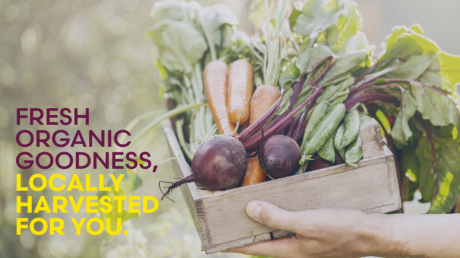
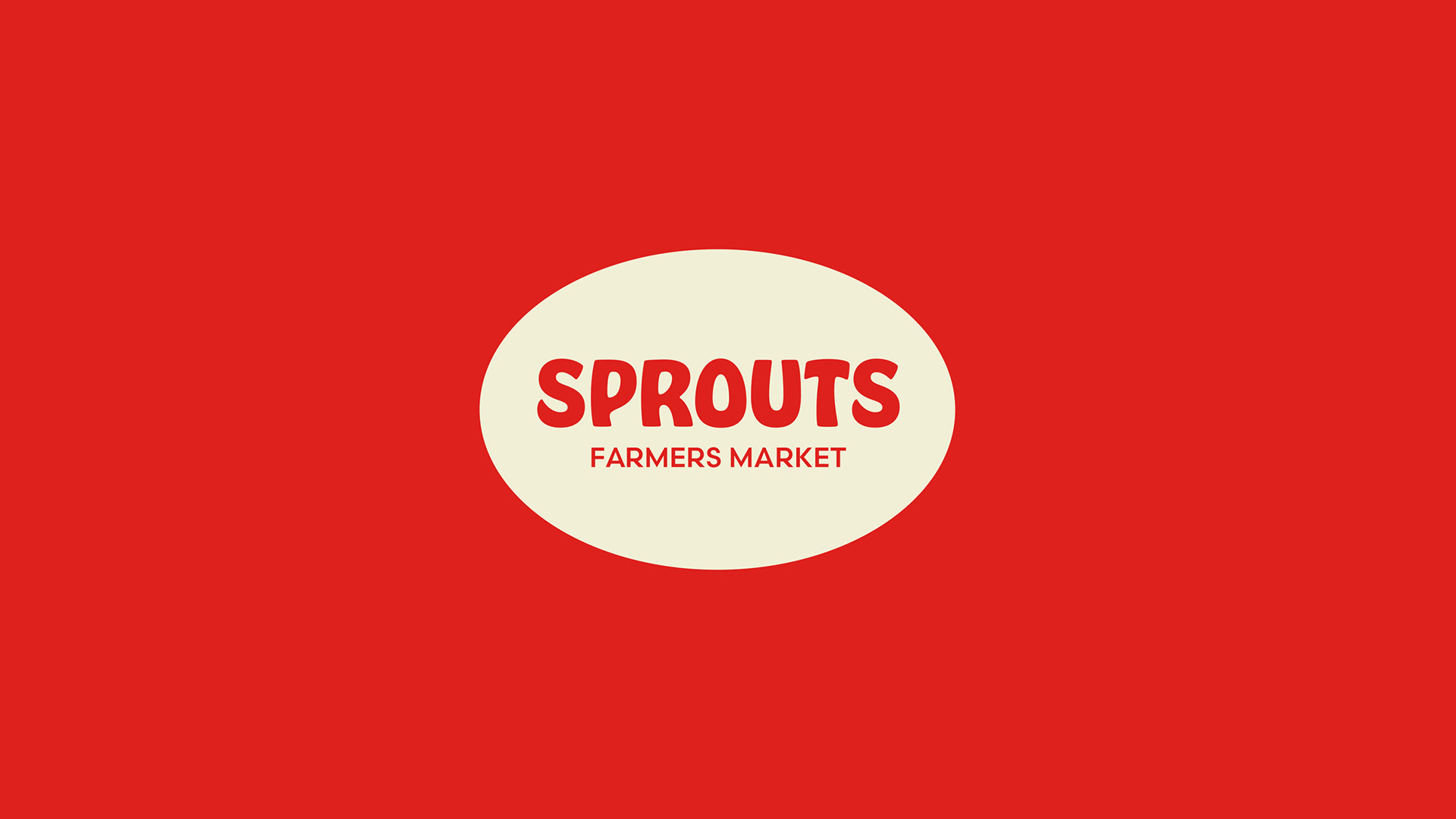
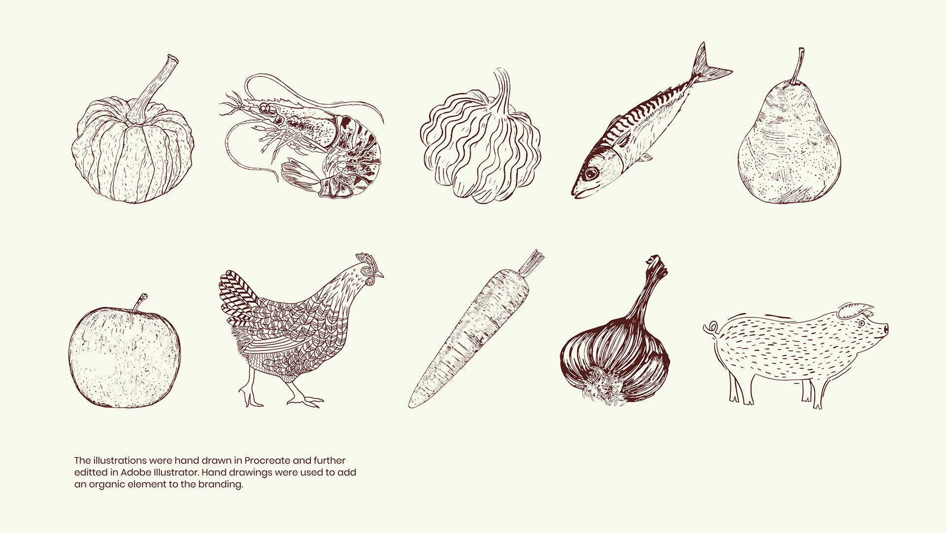
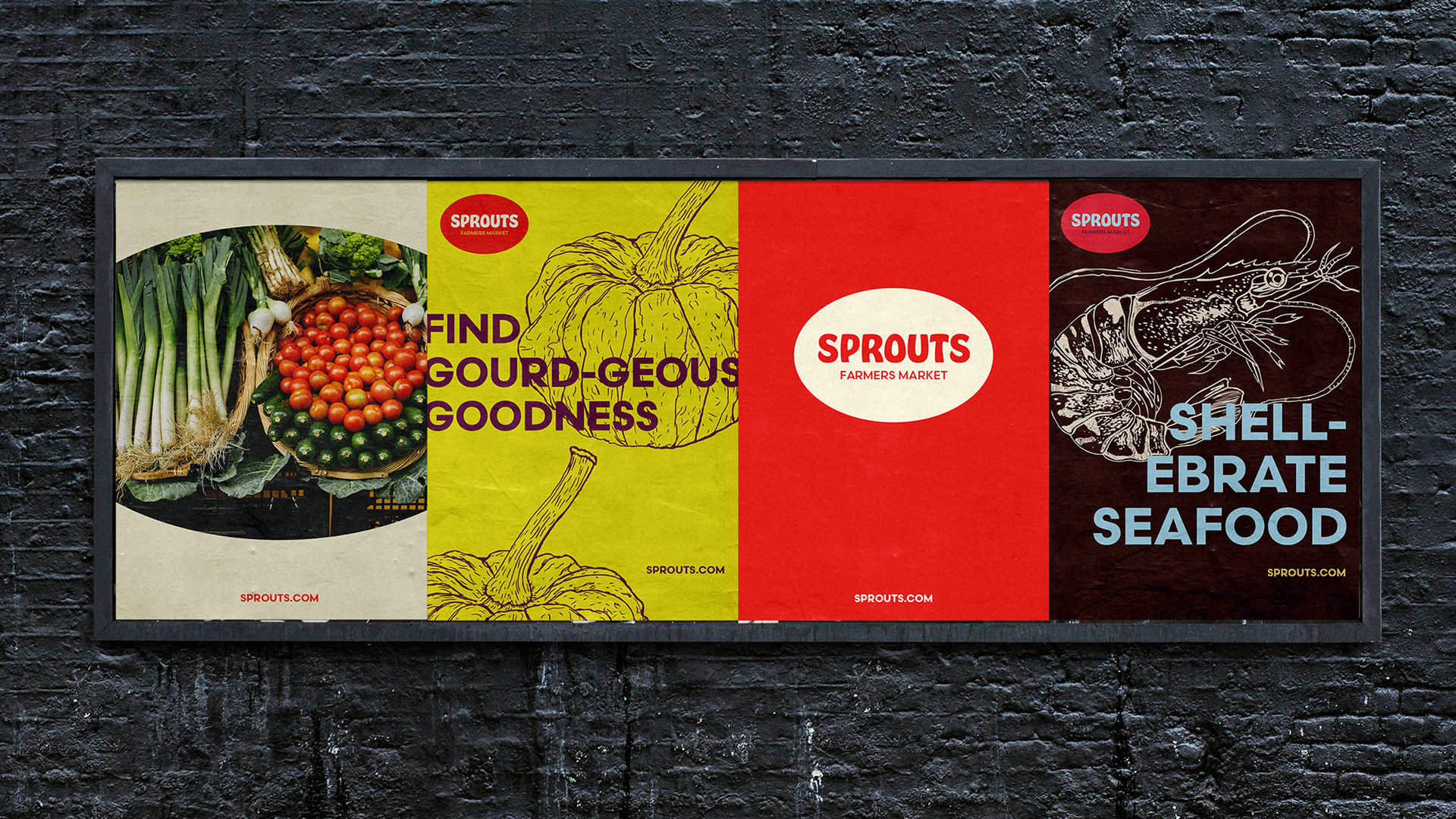
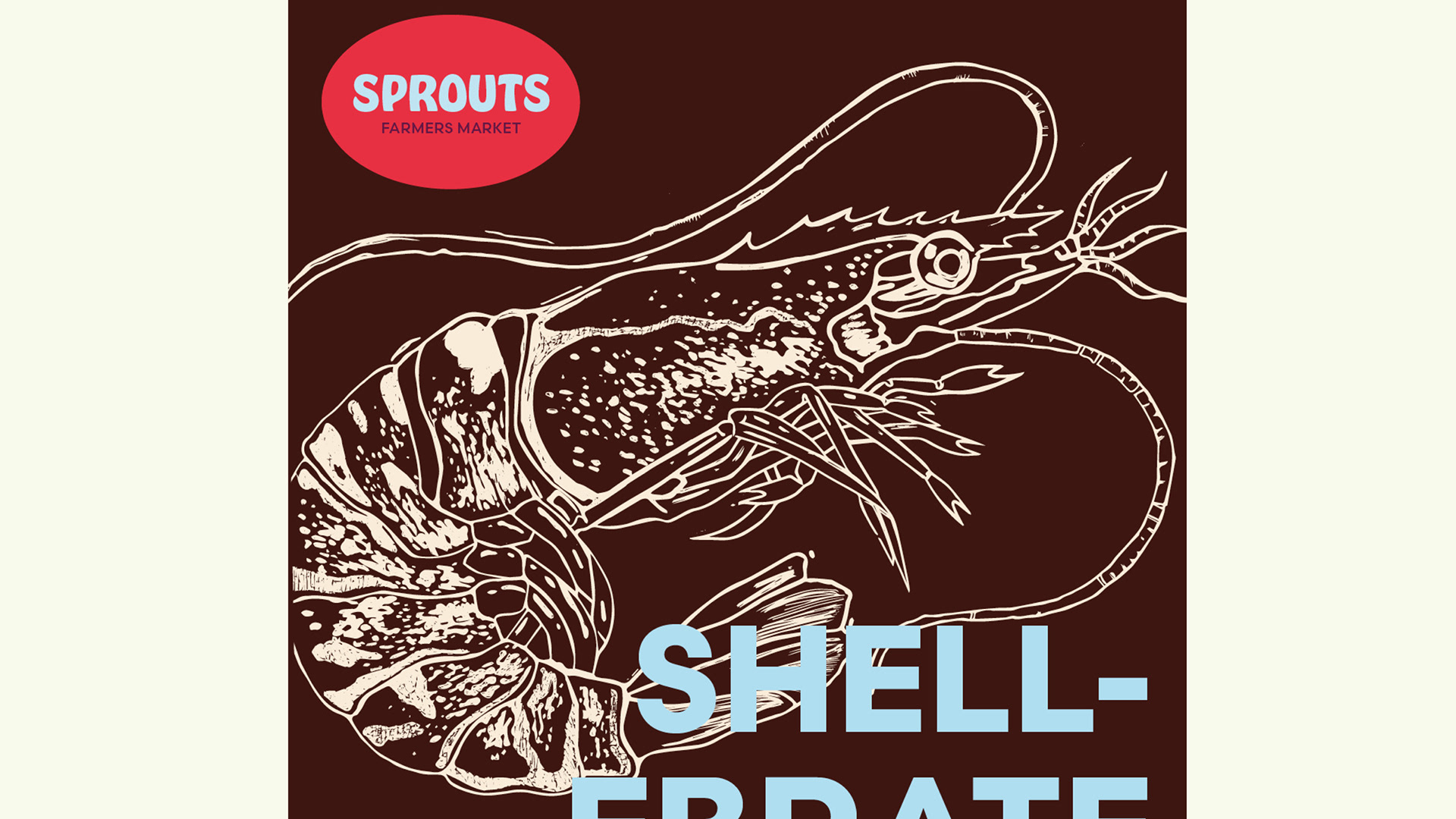
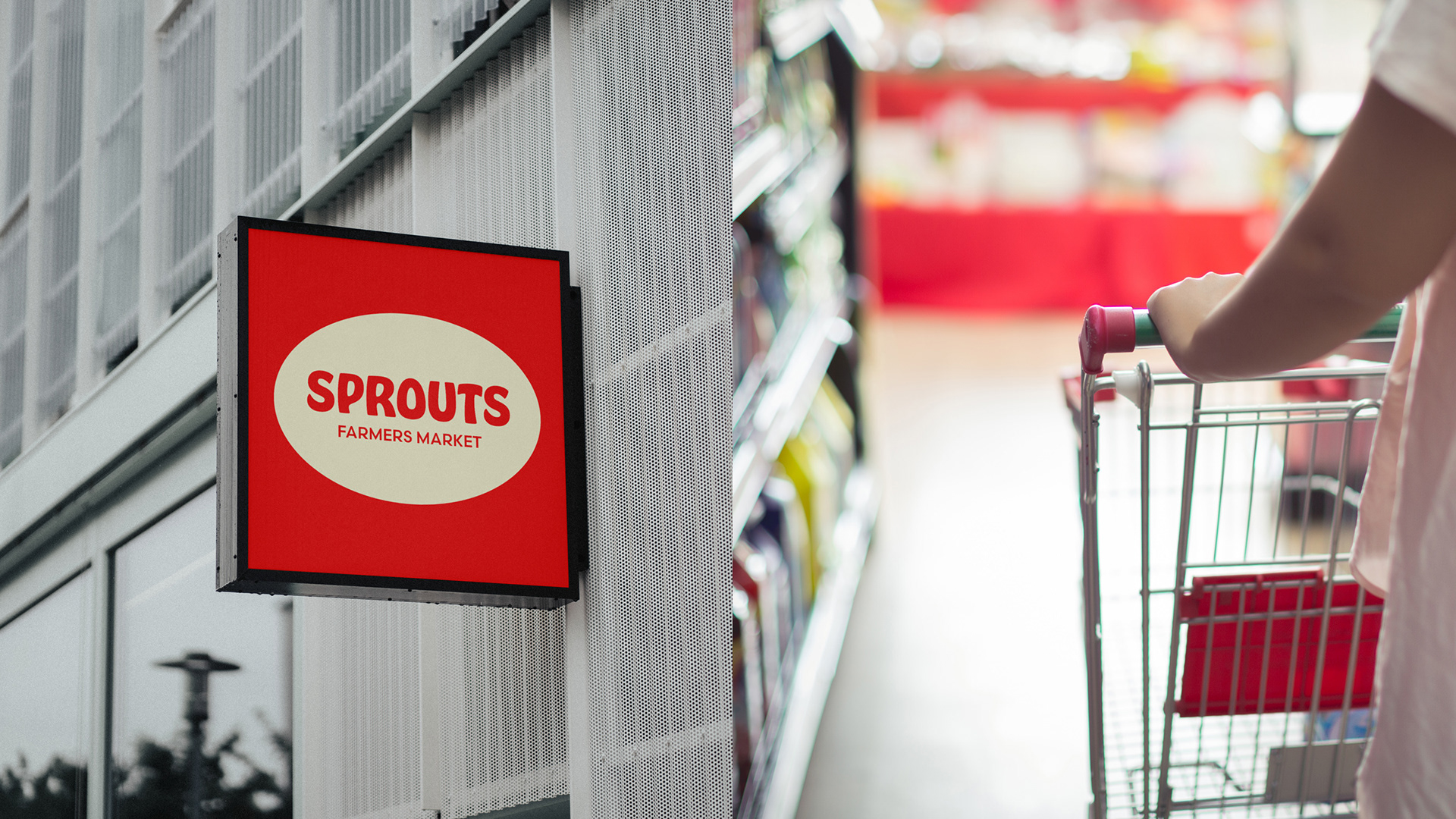
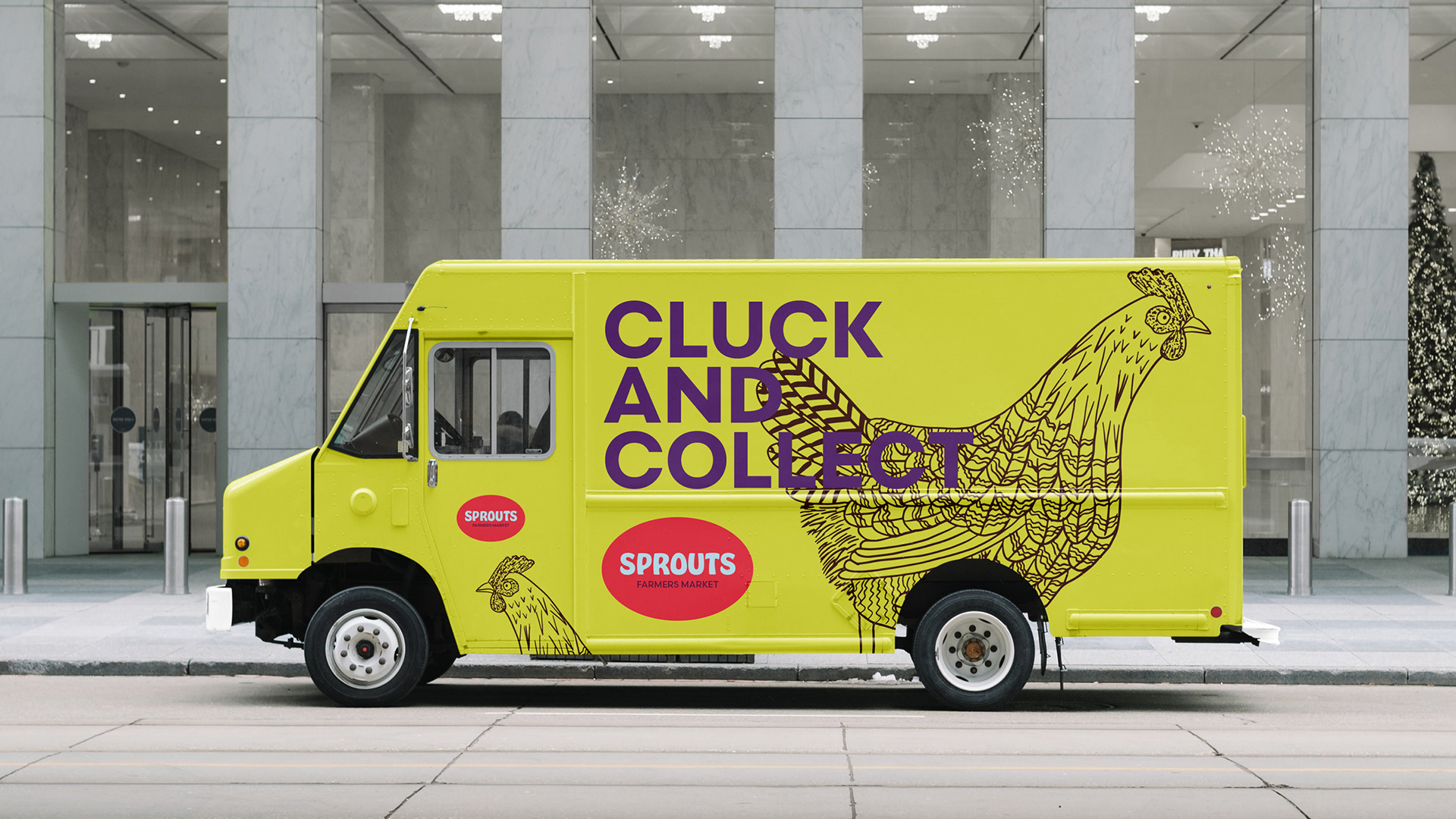
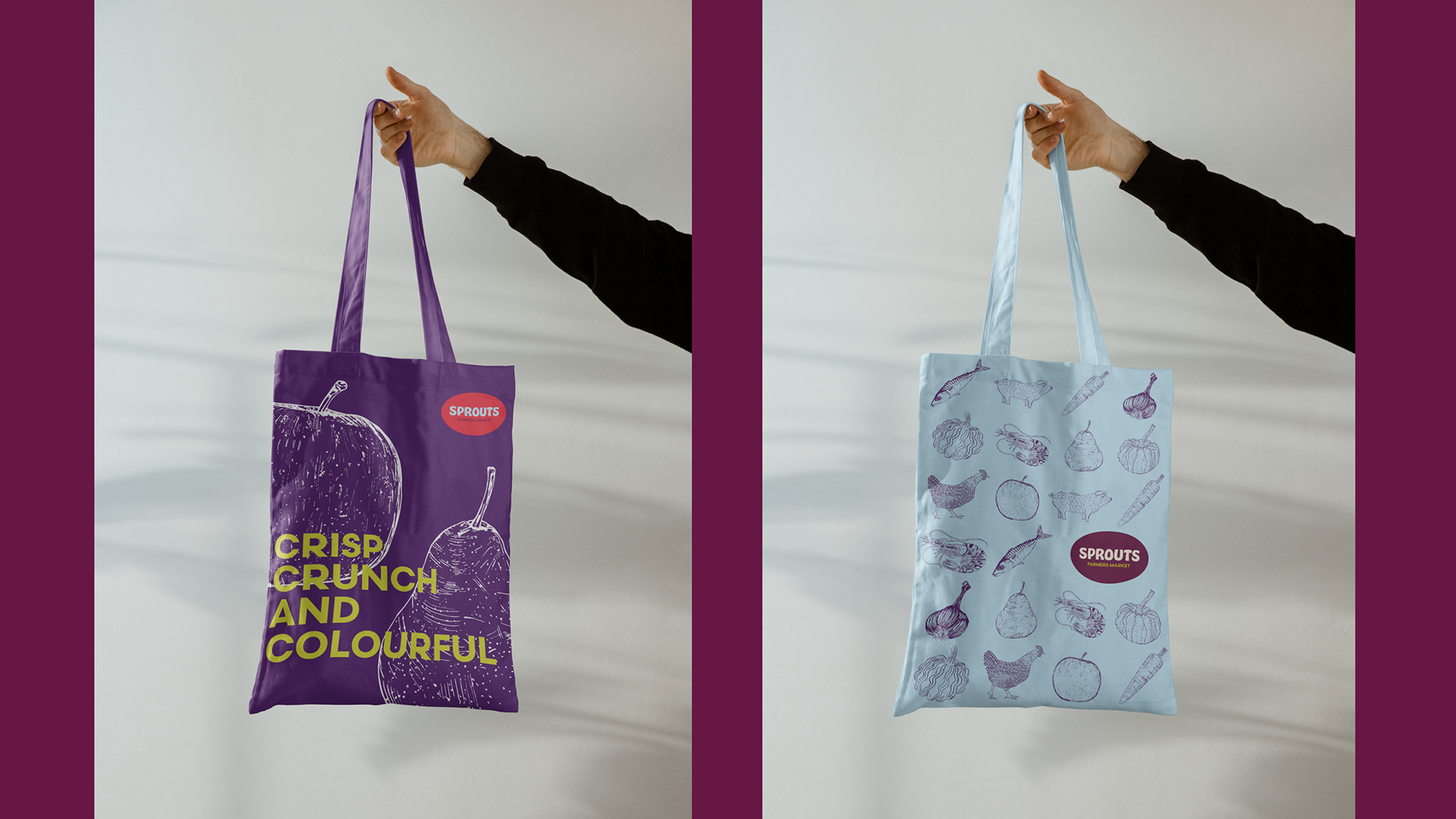
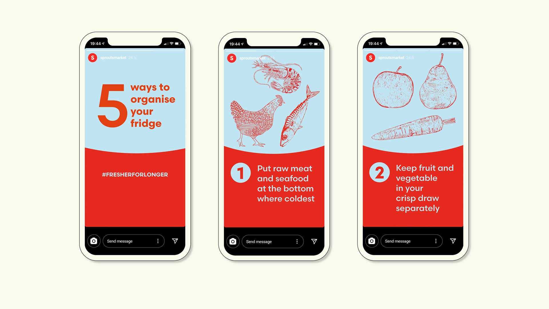
Sprouts now has an updated branding inspired by the fresh seasonal and organic produce in their stores. The new look is contemporary and lively, with hand-drawn organic sketches highlighting the beauty and abundance of the produce. The rebrand has a fresh and playful feel, featuring a bold new logo and striking typography. Despite the changes, Sprouts has managed to maintain its friendly and wholesome appeal, encouraging customers to make it their preferred local shopping destination.